When FareHarbor expanded internationally in 2018, I helped apply translation markup to roughly 10,000 text strings throughout our core application.
During this project, I proactively identified areas of improvement, such as inconsistent
capitalization or phrasing. An easy example: Learn more about Feature A, Learn how to use Feature B
and Get help with Feature C could all be changed to Learn more without degrading the user experience.

I also used this as an opportunity to rewrite copy in a more translation-friendly, future-proof way.
For example, text like Maintenance will take place from 2am-3am US Mountain Time on December 2nd
would have to be updated and retranslated every time our Engineering team performed planned maintenance.
This could be rewritten as Maintenance will take place on {{ datetime }}, allowing us to define
the date and time outside of the translatable text and represented as a variable instead.
For short standalone text, I learned the importance of providing in-line context for translators,
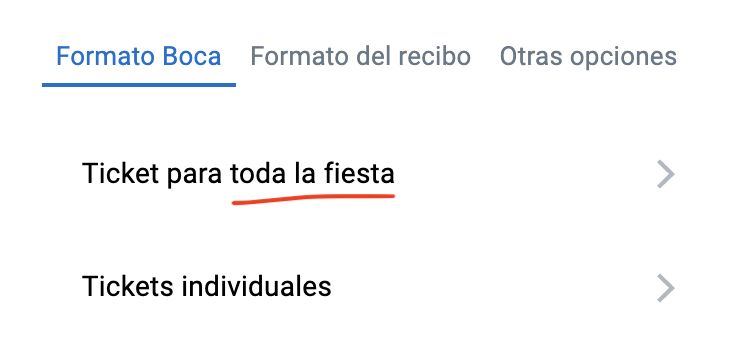
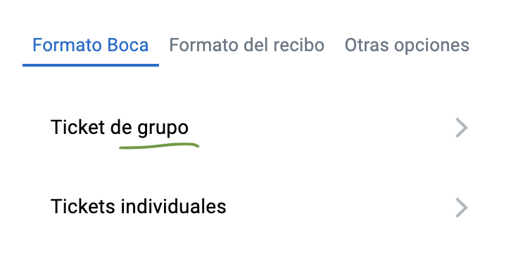
lest phrases like whole party—which referred to all individuals in a group—be translated
to toda la fiesta in Spanish.

oops!

ahh, much better.
Whenever we sent new text to the agency to be translated, I was the go-to person at FareHarbor who answered translators' questions, whether it was providing extra context or explaining where a specific piece of text was located in the UI.
Over time, I developed and documented a list of best practices that could be used by designers, product managers, and engineers when developing new features or writing new copy.
Footnote: This project gave me a crash course in how to use the command line and git. I have since committed 1,318 code changes (as of 2021) and authored 151 pull requests to improve and translate UX copy across FareHarbor's core web app.