As a Product Owner at FareHarbor, I used my writing and design skills to help distill complex concepts into simple user interfaces and clear, friendly UI copy.
Working closely with a tight-knit group of designers and engineers, I helped build some of FareHarbor's most impactful features, while also documenting them for a global user base.
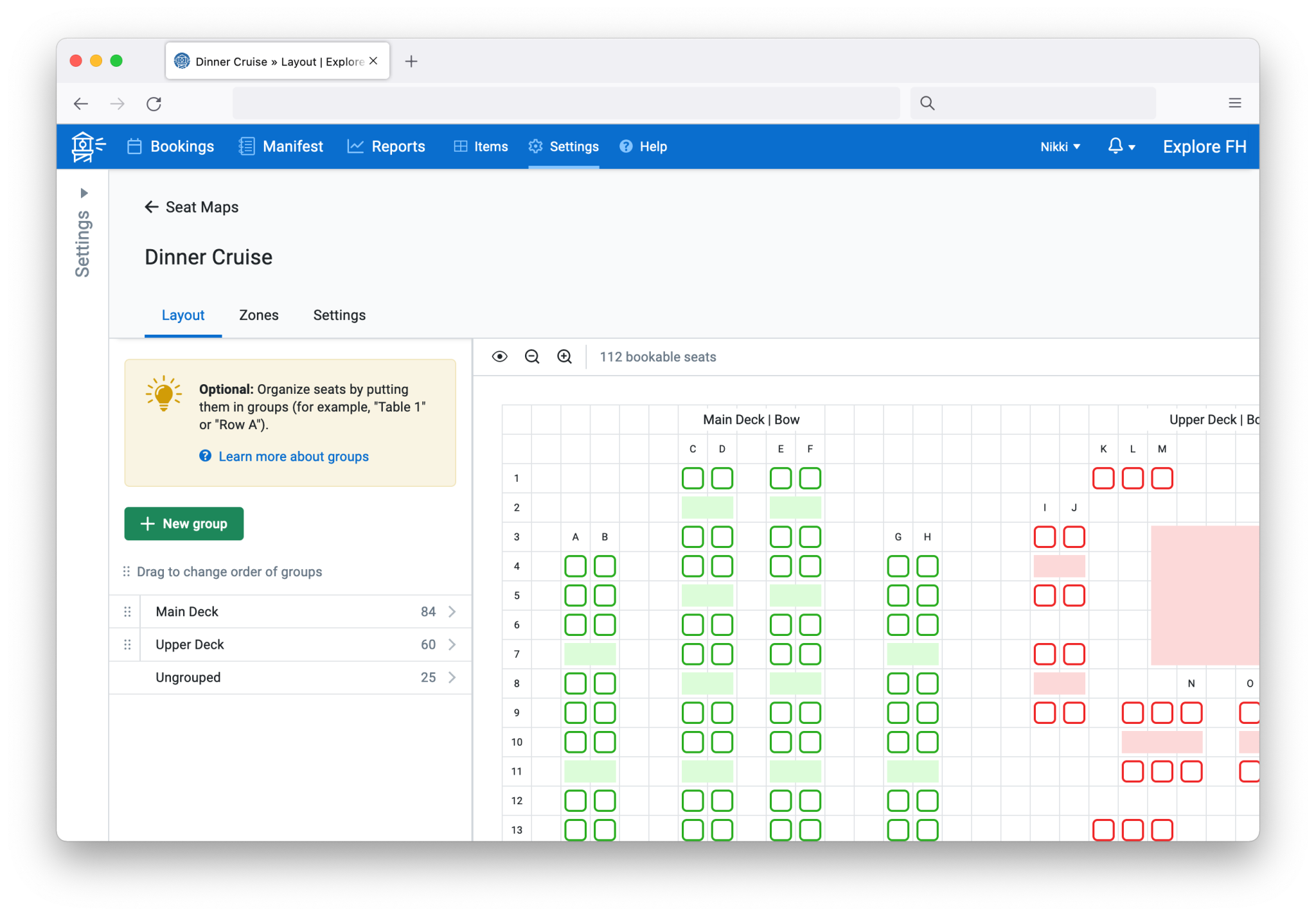
The purpose of the seat map builder, seen below, was to guide activity and event operators through the process of building a seating chart from scratch, using familiar UI elements and helpful copy. From tab names to explanatory text to tips, copy was meant to serve as an aid, but not a crutch.
For the seat selection interface, which was used by end consumers booking their activity online, concise and adaptable copy were key.
In this view, Choose your seat was too specific of an instruction; some of FareHarbor's clients would be using this feature for bookable spaces other than seats (think tables, vehicles, or axe throwing lanes). The text Choose from map gave tour and activity operators the flexibility to use their maps to best represent their own unique business, a theme we used throughout the end consumer-facing design.
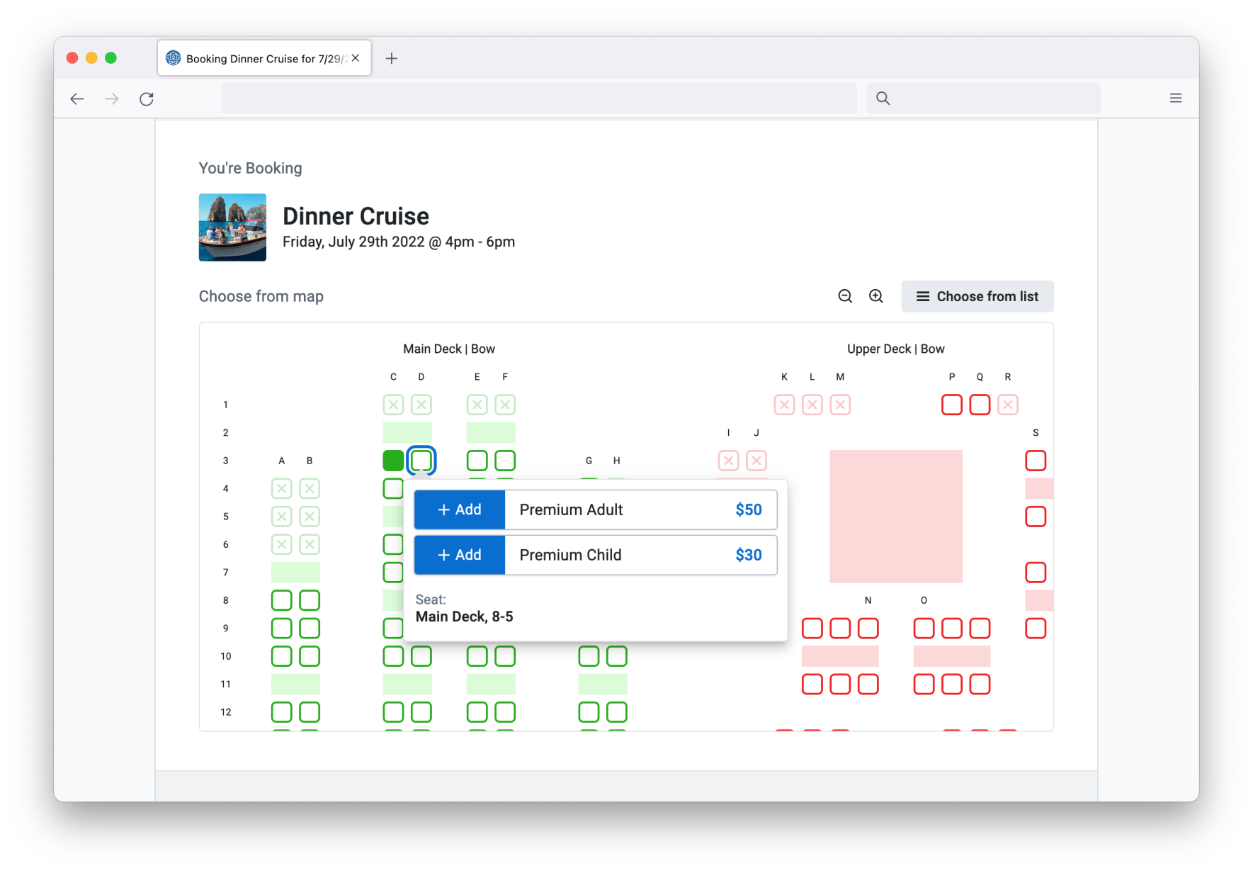
(The prefix in the flyout was customizable. In this example, it's Seat. For another activity operator, it may be Row or Selection or something else.)
Here too, copy was intentionally sparse so that activity and event operators could add specific instructions or context in their visual maps.
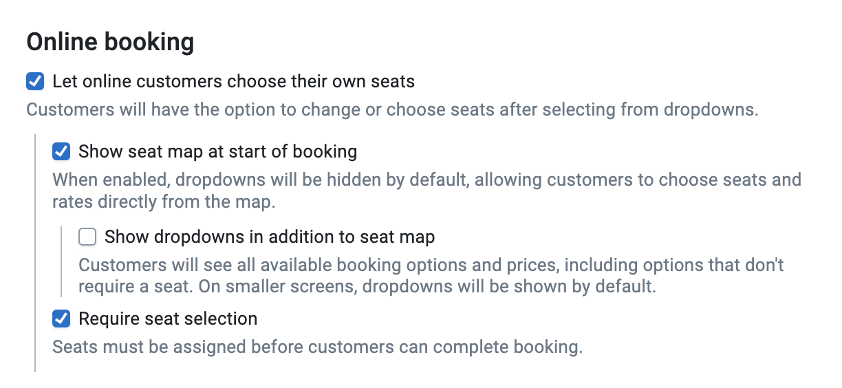
What the end customer saw was controlled by a wide range of settings behind the scenes. Depending on the type of activity they were booking, it may be more logical to show pricing options before letting them choose from the map. Or, in the case of a theater or venue, customers almost always expect to see a map first, which will help them decide which seats to choose.
These setting labels and explanatory text were intentionally verbose. Whereas help links and supporting documentation could always go into more detail, making the user leave the settings page—when perhaps all they are trying to do is make a quick change—was not ideal in this case. This set a precedent for documenting settings in-line as much as possible moving forward.
Going even further into advanced settings, users could map certain pricing options to specific parts (or zones) on their map, using FareHarbor's pre-existing resource requirement interface. Using a hierarchy of information and text, users could see at a glance how their mappings were set up:

This project featured a wide range of UX writing, from concise and friendly consumer copy to detailed and precise in-line documentation. In addition to managing the copywriting and documentation, I'm proud to have led the small design and engineering team that took this powerful feature from ideation to completion.